ROLE
Lead Designer
End-to-end Strategy
INDUSTRY
Internal Strategy
Global brand, vaccines sub-area
BRANDS
4 vaccine brands
Under 1 global parent
DURATION
9+ months
Ongoing – living system
Key constraints
-Built in parallel with ongoing production work
-The team was in charge of 4 different brands
-Most designers with no prior Figma experience
Stakeholders & collaboration
Working closely with the team’s PM, the Design Director, and a Lead Designer overseeing a parallel sub-area, coordinating across countries with no shared physical workspace.
«A fragmented workflow across 4 brands was costing the design team hours on every project. I redesigned how the team works cutting production time by nearly 43%.»
Overview
What began as a design tool migration evolved into a strategic redesign of the entire workflow.
As part of an Accenture design team I led and built a new workflow and Design System nearly from scratch for the design team in charge of producing assets for a business unit of a med company that managed the vaccine brands.
It centralized work across html emails, campaigns, web banners, social content, and video storyboard production. It turned scattered, inconsistent design practices into a well-structured and efficient process.
Discovery
Before proposing any solution, I ran two parallel discovery activities. First, I audited some existing projects, reviewing completed work to identify inconsistencies, repeated elements, and components that could be systematized. Also, I ran a group session with the design team to surface pain points directly. Designers documented their frustrations in a shared document which confirmed several issues I had already identified, but also revealed some others that I hadn’t considered from my own perspective alone.
Problem
The vaccines design team had no shared source of truth. Assets lived in local files, guidelines were scattered, and there was no naming convention so every project started with a search instead of a design.
The result:
- Repetitive manual work (Double work efforts)
- Inconsistent visuals across channels and designers
- Outdated or missing assets
- Work stored in local files
- Poor collaboration and communication between designers and teams.
- Each brand had its own style guide storage in diferente places
- Complicated access to assets
The real cost wasn’t just time. It was the constant uncertainty of not knowing whether what you were designing was correct.
Goal
Design and implement a unified workflow and design system that would give a single source of truth to the design team: reducing production time, eliminating redundant work, and ensuring brand and regulatory consistency on every deliverable.
The system also needed to scale to be accessible to 20+ designers who could step in at any point without losing context or continuity.
Deliverables
- 4 brand library
- A single Design System for all brands
- Documentation
- Training
Tools
- Figma
- Adobe Illustrator
- Adobe XD
- Adobe Firefly
- Company CMS
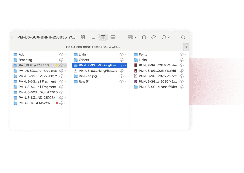
From Chaos to Clarity: Streamlining Version Control
before
Every project lived on individual designers’ local machines. There was no shared visibility into versions, project stages, or who owned what, and when a designer went on leave, often their projects went with them.
The existing job naming convention existed by the company’s format, but without a centralized file structure to support it, projects still ended up scattered, duplicated, and inconsistent.
Key decision
The team had recently acquired a Figma license and I rather than treating the migration as a tool swap, I saw it as a strategic opportunity to redesign how the team organized and shared work entirely, moving from local files to a cloud-based, structured workspace accessible to all 20+ designers at any time.
after
I defined a standardized file setup structure for every new project and co-created a video tutorial «How to Set Up Your Figma File» with the other Lead Designer, so the system could be adopted consistently from day one, by anyone on the team.
To date, 50+ projects have been migrated to the centralized workspace. Designers can now pick up any project regardless of who started it, without losing context or time and with a efficient async communication through Figma comments.
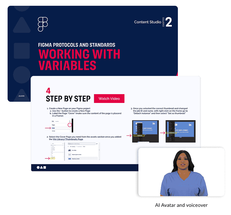
Accelerating Adoption: Simplifying the Figma Learning Curve
Moving to Figma Cloud solved the collaboration problem but introduced a new one. Most designers on the team had never used Figma before, and the file setup I had defined was specific to the team’s workflow, with requirements that generic documentation or video tutorials simply didn’t cover.
Without a clear onboarding path, the system risked being adopted inconsistently or not at all.
Solution
I produced a series of step-by-step video tutorials covering the team’s specific Figma setup from Auto Layout and design tokens to variables and theme switching. To optimize production, I used an AI-generated avatar and voiceover instead of recording myself which avoided retakes and made it easier to update the content.
Key decision
Instead of pointing the team to Figma’s official documentation, I created a series of custom tutorials tailored to the team’s specific setup covering only what was relevant to our workflow, in the exact order designers would encounter it. The goal was also to reduce the onboarding friction for new joiners.
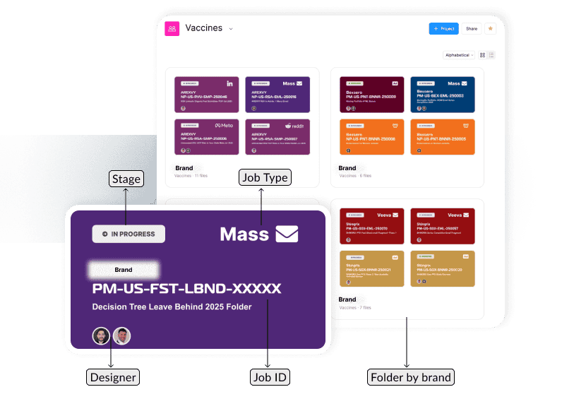
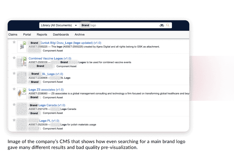
From Scattered Files to a Unified Asset Library
Before
Assets for all four vaccine brands lived in the company’s CMS, a system with no naming convention, inconsistent previews, and search results that returned duplicates, outdated versions, and campaign-specific files.
Finding a single brand logo could return 10+ results. That make difficult for the designers to know which one was current, which was campaign-specific, or which version they were supposed to use.
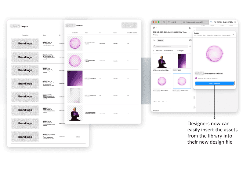
After
The library now holds 100+ assets across 4 brands, organized so any designer can find, preview, and insert the right asset directly into their design file — without touching the CMS.
A direct CMS link is embedded in each asset for the designers to verify assets with expiration dates or campaign restrictions , giving designers full context without breaking their workflow. What used to be a multi-step search is now a single lookup.
Stakeholder concern → design solution
The Design Director raised a valid concern: some assets were campaign-specific or had expiration dates. Rather than leaving that gap open, I added a direct CMS link to each asset, so designers could verify validity without leaving their workflow. That addressed the concern and removed the last blocker to approval.
Key decision
I structured the library as a dedicated Figma file separate from the design system, a technical decision driven by load performance as assets grew. The Design Director was concerned about multiple file complexity for new Figma users, but a quick demo of how easily libraries are called in Figma files, let him knew it could be a good move.
Scaling Design Efficiency Through a Unified System
The team needed a unified system to reduce duplicated work, ensure design consistency, and provide quick access to assets across multiple brands.
Before
With no shared component library, every designer started from scratch — copying elements from previous jobs, manually recreating typography scales, color tokens, and grids, and hoping the version they referenced was still current.
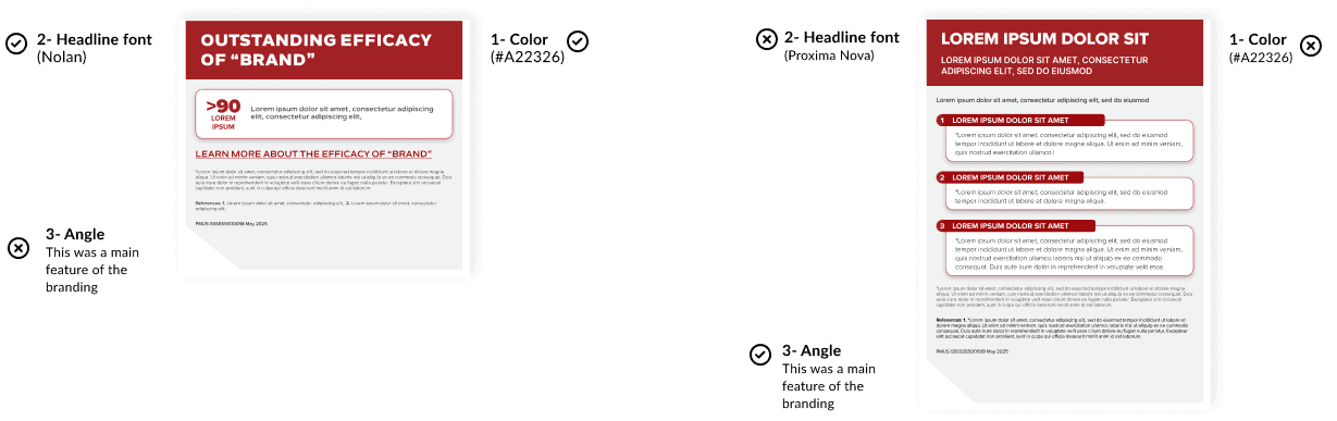
The problem showed up in the output: a project audit revealed inconsistencies in typography, colors, and layout structure across assets that should have followed the same brand guidelines — sometimes within the same campaign.
This images shows examples of usual differences found during the projects audit in some assets that should follow the same brand guidelines and channel specs.
Key decision
I proposed to build a design system with Atomic Design principles to serve 4 brands from a single shared foundation.
I developed the complete DS only some components shared with other sub-area were developed collaboratively.
After
A Design System build based on Atomic Design principles, structured through “Themes”, “Properties”, and reusable components.
The system now covers 30+ components and templates across 4 brand themes all driven by variables and shared styles, so switching between brands is a theme change, not a rebuild.
Still evolving, but already functional enough to test. To measure real impact, I ran a timed comparison using the two highest-volume deliverables in the studio (an email and a banner) producing each with and without the system.
Components set up with toggles and variants for easy personalization.
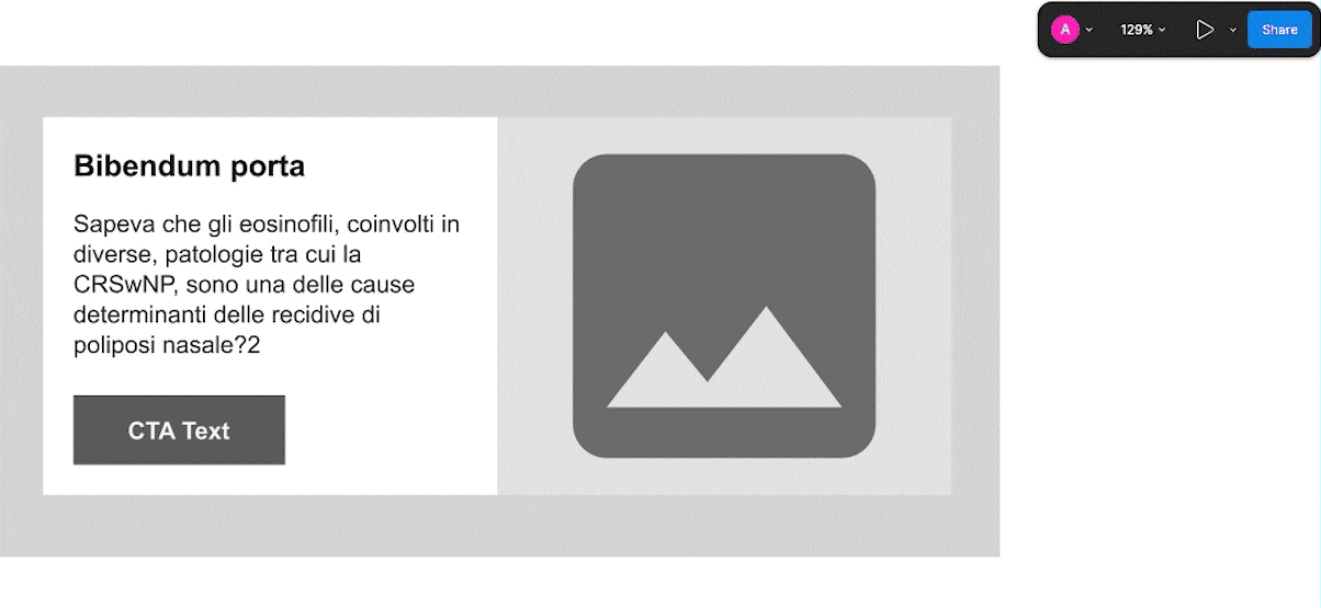
Easy change of brand theme
These images shows some parts of the Design System created
Stakeholder concern → design solution
Both the PM and Design Director had reservations: time to build, and learning curve for the team.
I reframed it: designers didn’t need to learn how to build a system, just how to use one, and if built well, that should be effortless.
To prove it, I ran a live demo. It landed, and the initiative was approved on the spot.
Stakeholder concern → design solution
My initial proposal was a separate system per brand. The Design Director pushed back.
He held his position: one system per sub-area, covering all brands. That constraint pushed me to research further, and that led me to Figma themes and modes.
Iteration after launch
Once the first version of the library and design system were live, I asked the team to use them on real projects before. Feedback came through Teams chats, Figma comments, and team meeting, some of it urgent: components with missing responsive behavior or features that forced designers to detach them, breaking the system’s integrity. Those fixes were prioritized immediately.
Impact
~43%
Faster production time
From ~3 hrs to ~1.7 hrs on some projects. Client revisions for design inconsistencies are no longer a recurring issue.
4 brands
One source of truth
Brand and regulatory consistency enforced through shared variables and components, eliminating design-related rework.
1hr→ aprox 30 min
Onboarding time reduced
New joiners onboard independently through video tutorials. Sessions are now optional — 30 min max, only for specific questions.
20+
Designers empowered
Including a Lead Designer with no prior Figma experience, now producing responsive, multi-brand assets independently.
Validated by senior leadership
Scalable framework for future growth
Presented to the Delivery Lead — senior manager overseeing all studio sub-areas — and received explicit recognition. The modular structure scales as new brands, channels, or team members are added.