Clinical Trials Web page re-design
CASE STUDY
ROLE
UX/UI Designer
In a team of 5 designers, one PM
INDUSTRY
Clinical Trials
Global brand
DURATION
3+ months
Overview
This project was a UX/UI redesign of an existing clinical trials analysis web platform — a SaaS product previously delivered to the client that needed improvements to navigation, visual structure, and design scalability.
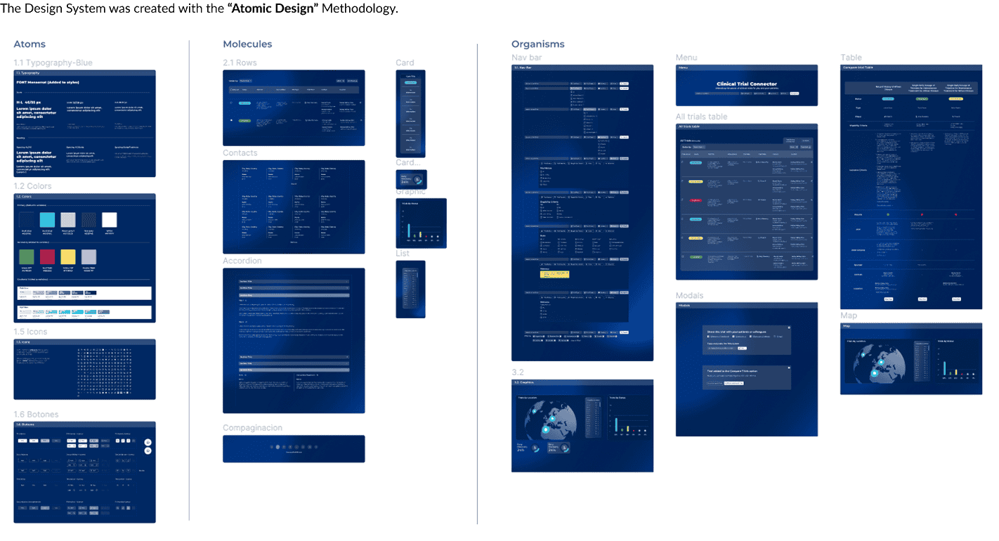
Working as part of a cross-functional team of 5 designers, 1 PM and a Design Director. I contributed to the homepage redesign, clinical data visualizations, Design System construction, and prototype development. The project migrated all design files from Adobe XD to Figma, adopting an Atomic Design methodology to ensure consistency and scalability.
Problem
The existing platform had accumulated usability and visual consistency issues that affected how users navigated and understood clinical trial information:
- Overloaded navigation: Main menu had too many options with no clear hierarchy
- Confusing visual language: Misleading icons, poor color usage, and inconsistent UI elements created friction
- High information density: Content-heavy pages lacked visual structure, making scanning difficult
- Outdated design files: Adobe XD files limited collaboration, dev handoff, and design reviews
Goal
Redesign the clinical trials platform to improve navigation clarity, visual communication, and information hierarchy while building a scalable Design System in Figma that supports consistency, accessibility, and future growth.
Deliverables
- UX/UI Redesign
- Design system for the web page
- User testing analysis
Tools
- Figma
- Adobe Illustrator
- Adobe XD
Research & Insights
Due to limited access to end users, research was adapted around three methods: a heuristic evaluation conducted by 4 UX/UI designers with medical industry experience, an analysis of existing user flows within the platform, and benchmarking of comparable clinical trial platforms to identify patterns, terminology, and iconography standards.
As one of the more experienced designers on the team, I guided less experienced members through the heuristic process, ensuring findings were grounded in UX principles rather than visual preference.
Findings
- Visual elements caused confusion
- Main menu overloaded options
- Poor color and hierarchy usage
- Redundant navigation in flow
- Weak visual content hierarchy
- High information density overload
- Misleading and confusing icons
Key finding
Redundant steps in core navigation flows forced users through unnecessary screens to complete basic tasks, directly impacting task completion in an already complex information environment.
Definition & Strategy
With a clear picture of the platform’s pain points, the team aligned on a shared problem statement and defined the design direction before moving into ideation.
Strategy
- Clarifying architecture and flow to make exploration more intuitive.
- Unifying visual design through a scalable component system.
- Improving collaboration by organizing design files in Figma with clear hierarchy and reusable styles.
The main user flow was the one with most issues.
Key Decision
The original brief was primarily technical, migrate to Figma, redesign the UI, build a Design System. After the heuristic evaluation, I proposed reframing the core problem around the user, shifting the team’s focus from deliverables to the experience gaps actually affecting task completion. The team adopted this approach, grounding all subsequent decisions in user needs.
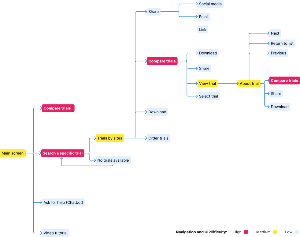
Ideation & Information Architecture
With research findings as a guide, the team explored structural solutions through wireframing before moving into high fidelity. I owned the wireframes for the sections I redesigned, using them to validate layout decisions and navigation logic before committing to UI.
- Introduced a simplified, persistent main menu.
- Assign color to differentiate UI elements from visual elements and to clarify the information.
- Visual hierarchization of important sections.
- Iconography replacement for better communication.
- Highlighted primary user actions (search, register, learn).
- Consolidated related pages into clearer categories.
Key Decision
The search and filter menu required too many steps before users could reach results. I consolidated essential filters into a simplified menu, moved secondary options under a «More» control, and added persistent visible filter indicators for active filters so users always understood what was driving their results.
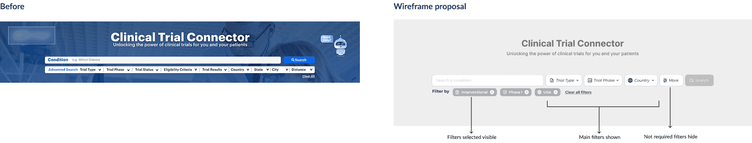
Graphics shown after pressing «Search»:
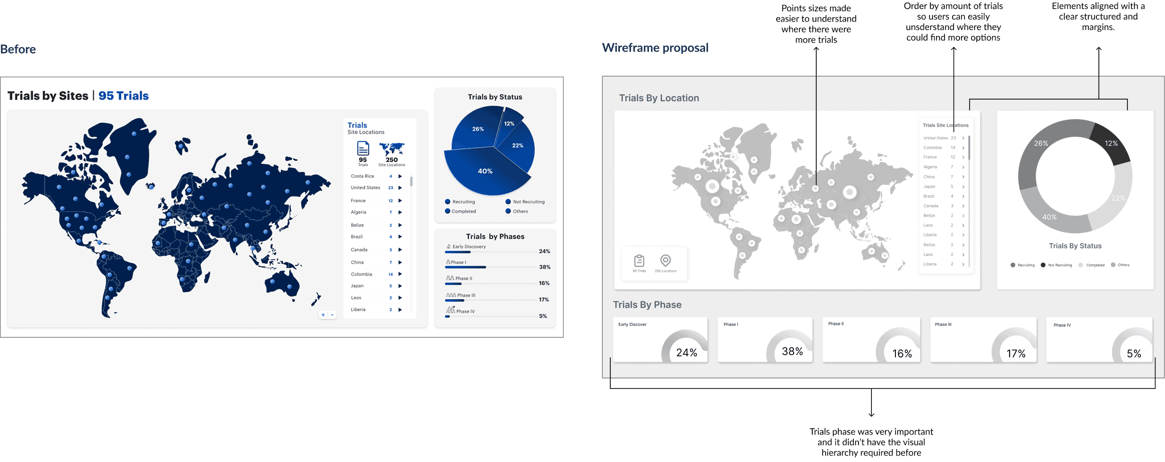
Note: The examples above highlight two of my key contributions to the redesign. Due to the collaborative nature of the project, not all individual changes are documented here, but these represent the decisions where my involvement and criteria had the most direct impact on the user experience.
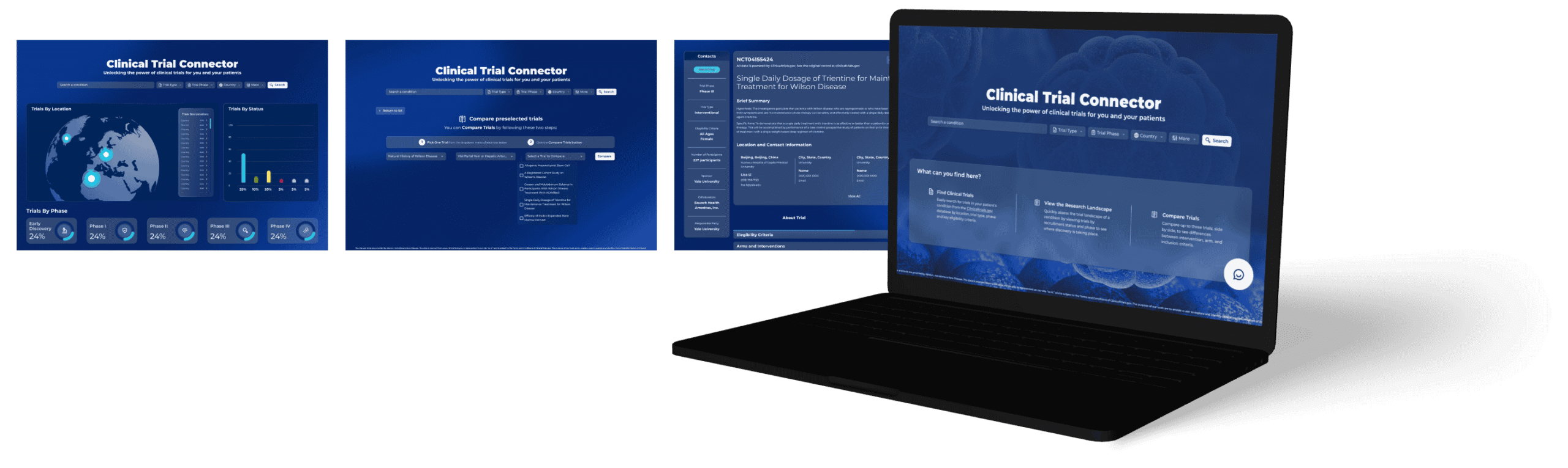
UI Design & Systemization
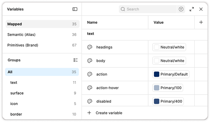
The visual redesign aimed to bring clarity, trust, and structure. The new design was created with dark background to bring modernization, medical atmosphere and differentiation. We created a new design system in Figma, with color variables, typography scales, and reusable components aligned with accessibility and brand identity.
Focus areas:
- Improved contrast and readability.
- Visual patterns that support content scanning.
- File organization that allows easy updates and handoffs.
Tokens were created to maintain consistency across all components.
Impact
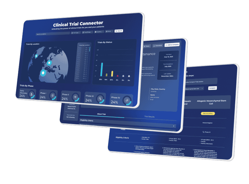
Full platform redesign
All sections went through a visual overhaul; those that maintained their structure were updated to align with the new look and feel
Figma-based workflow
Full migration from Adobe XD, with organized files ready for collaboration and dev handoff
Design System at 60% completion
includes 12 organism-level components, plus the full atomic foundation: color scales, typographic hierarchy, button states, molecules, and templates
Interactive prototype
ready for usability testing, focused on task completion and navigation clarity
Inicial client approval
The redesign was presented to the client and received positive feedback on the new visual direction, navigation structure, and overall aesthetic
Prototype & Testing (Next Steps)
An interactive prototype was built in Figma to visualize new user flows and validate navigation clarity. Upcoming usability testing sessions will focus on:
Focus areas:
- Ease of finding trial information.
- Understanding of page hierarchy and terminology.
- Perceived trust and visual coherence.