ROLE
Lead UX/UI Designer
INDUSTRY
Pharma
DURATION
5+ months
Key constraints
-The web page need to be created from scratch in a limited period of time.
-Color palette had to be tested for web accessibility standards.
-The PM was new in the team.
Stakeholders & collaboration
Working closely with the team’s PM, copywriters, DXM team, development team, marketers, and Design Director, coordinating across countries through both synchronous and asynchronous communication.
Overview
This project migrated and redesigned a vaccine brand’s web presence from a subpage buried within the main pharmaceutical brand’s product catalog, to a standalone website with its own domain and identity.
Designed for Health Care Professionals (HCPs) seeking clinical information, the site was built from scratch following the global business design system and WCAG 2.1 AA accessibility standards. I led the design effort across multiple designers, each owning individual pages within a shared Figma file.
Problem
The vaccine brand lacked its own digital home. Its web presence lived as a subpage inside the main pharmaceutical brand’s product section. That structure created three compounding problems:
- Fragmented brand identity: Global and product brand styles coexisted inconsistently across UI elements, creating a confusing experience for HCPs.
- Limited scalability: The existing structure couldn’t support the new sections and content the brand needed to grow.
- Missed marketing opportunity: As the product gained relevance, the brand needed a dedicated domain to support marketing strategies, traffic analysis, and increased visibility among HCPs.
Goal
Design and deliver a standalone website with its own domain for the vaccine brand that establishes a clear and consistent brand identity, meets WCAG 2.1 AA accessibility standards, scales with the brand’s content needs, and provides HCPs with a clear, efficient path to clinical information.
Deliverables
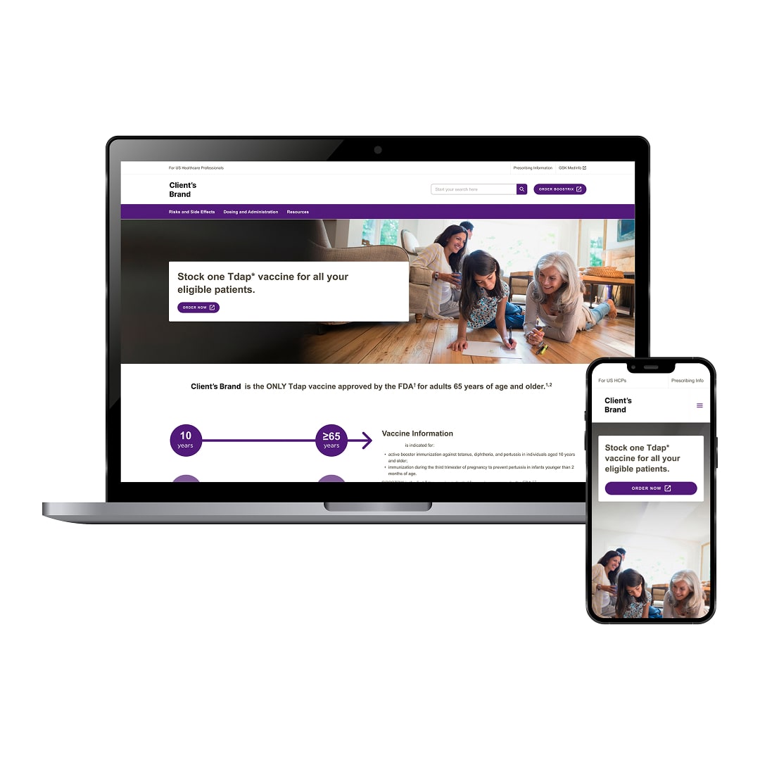
- A complete web experience of 10 designed screens and states — homepage, 3 subpages, header, footer, persistent ISI section, 404 page, search results page, loading state, and exit overlay. Designed for both desktop and mobile.
Tools
- Figma
- Business Design System
- Tokens Studio (Plugin)
- Jira
Design process
1. Discovery & alignment
I kicked off the project with a heuristic analysis of the existing site, benchmarking it against other pharma brand sites we had previously worked with. This surfaced key opportunities across four areas: color accessibility, information hierarchy, content structure, and overall user experience.
Main challenge
The brand did not have its own individual website, creating uncertainty around how its color palette would translate to web purposes.
Actions
- Audited the existing site across color accessibility, information hierarchy, content structure, and UX
- Benchmarked against pharma brand sites previously worked on
- Aligned with PM, copywriters, developers, and DXM team on scope, priorities, and technical constraints
- Conducted WCAG 2.1 AA analysis of contrast ratios, font sizes, and typographic hierarchy
Key decision
I recommended creating a dedicated Resources subpage rather than embedding the new content into an existing section. The client followed this recommendation, keeping each section focused and consistent with IA patterns applied across other pharma sites.
Stakeholders constrain
Both the PM and the client weren’t taking into account that we also needed to design the different UI states (feedback, loading, empty, and error states). I pushed back to make sure those were included in the scope.
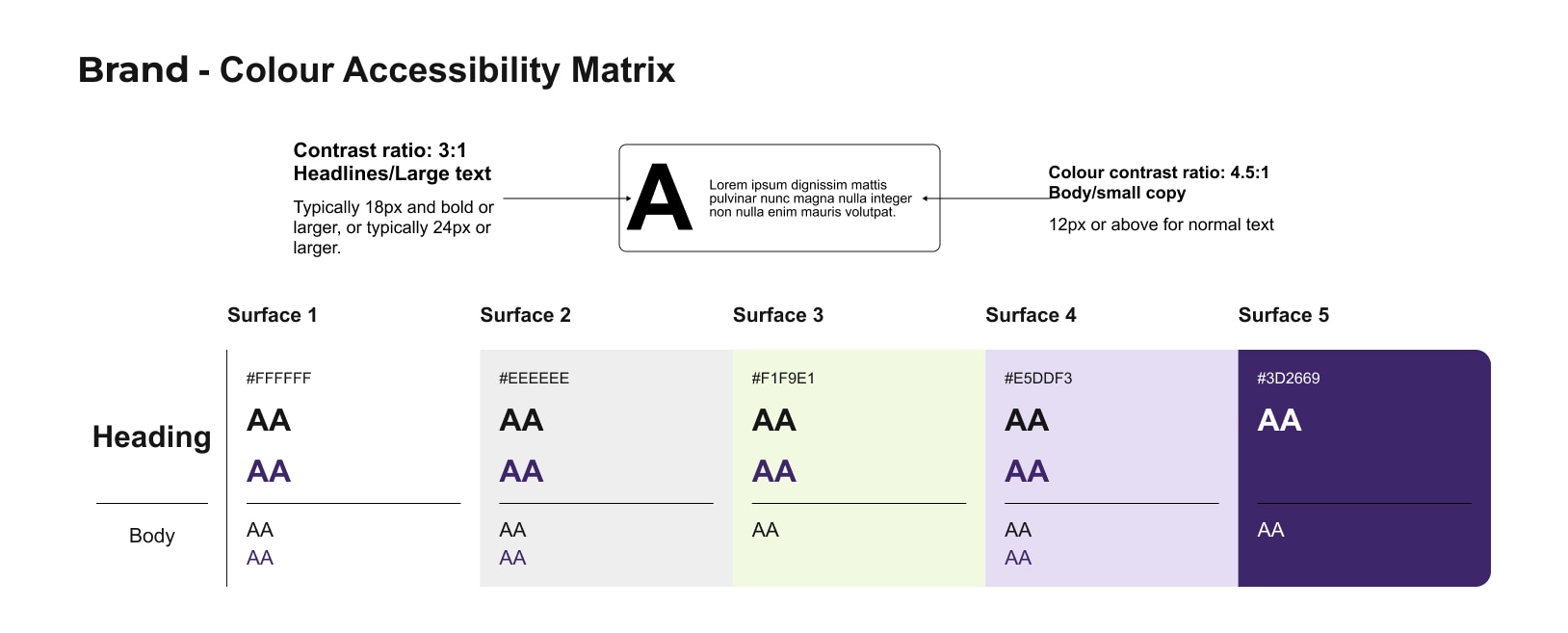
A deep analysis on the colors accessibility was needed in order to be approved by the Digital Experience Management (DXM) team.
Each component was tested to evaluate how it would appear with the brand color palette and whether it complied with accessibility standards.
2. UI Design & Component Integration
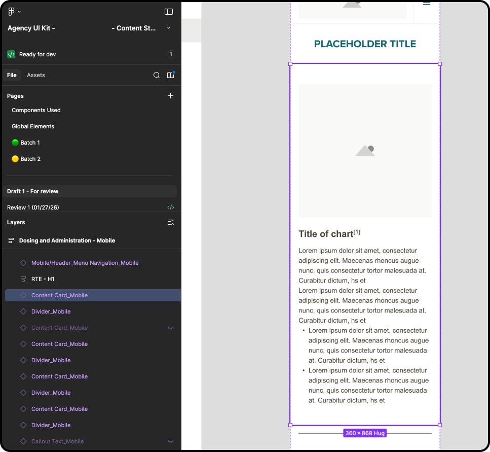
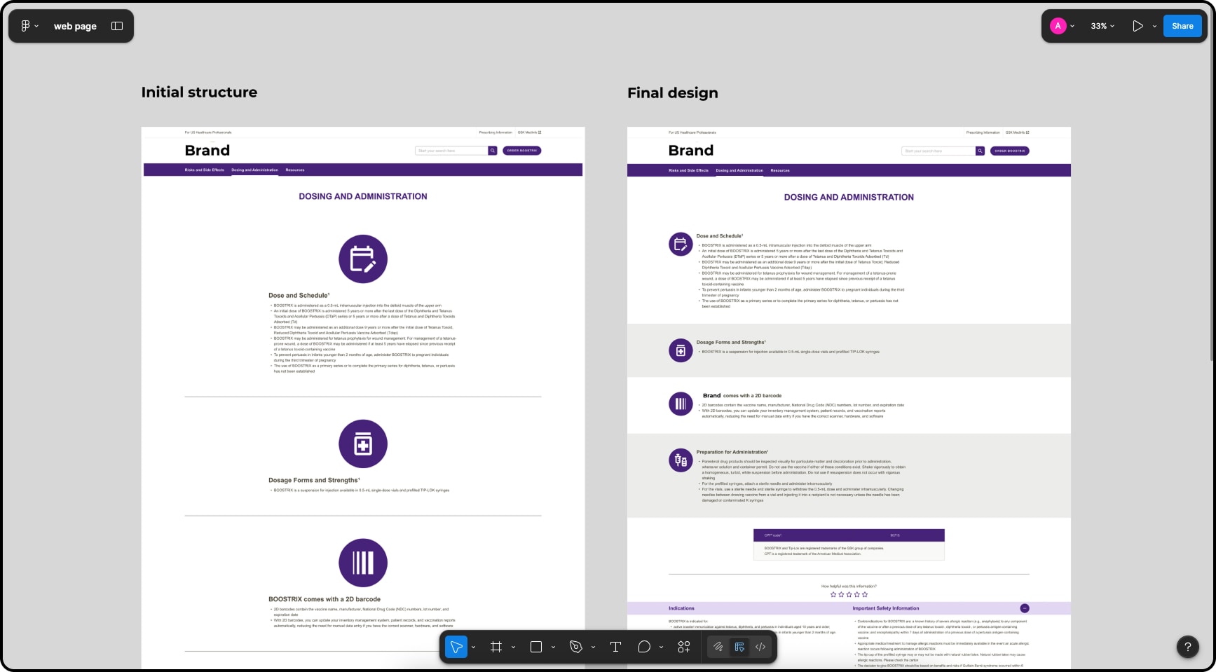
Starting from the copy deck and brief, I built initial wireframes to map content requirements to Design System components in their default state, establishing a structural foundation before moving into high fidelity.
Challenge
The complexity of some components and specifications required a deep understanding of the Design System documentation.
Actions
- I collaborated closely with the DXM team to resolve complex specifications, which allowed us to implement components consistently across all pages.
- Selected and adapted Design System components via Figma + Tokens Studio
- Defined layouts, component adaptations, visual hierarchy, and mobile breakpoints across all 10 screens and states
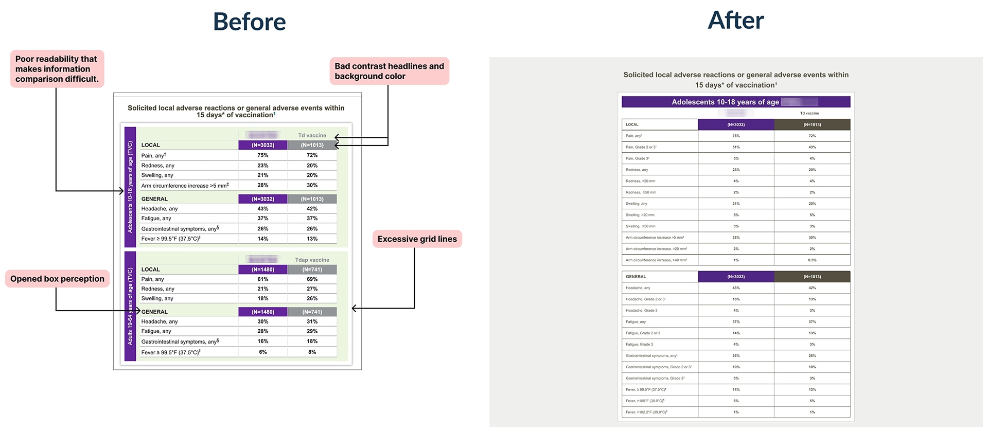
- Redesigned data tables for improved readability and brand consistency
- Transformed text-only sections into structured layouts with iconography and alternating backgrounds to improve scannability for HCPs
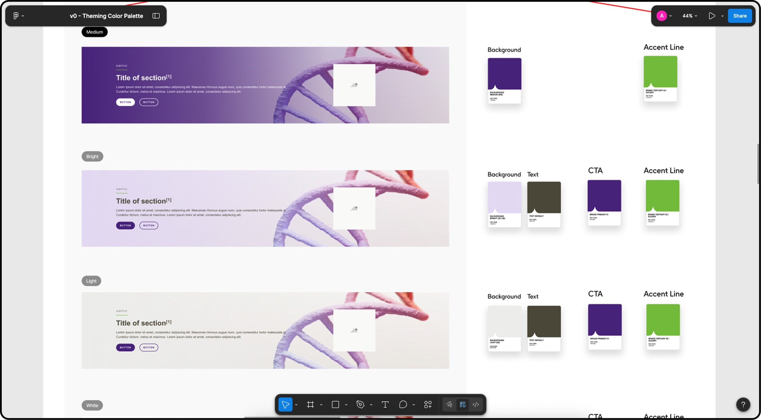
Key decision
Rather than applying brand colors manually, I maintained continuous communication with the DXM team throughout the process sharing the validated palette iteratively and coordinating its registration as design tokens in the design system and Tokens Studio.
Stakeholder constrain
Some designers not familiarized with using robust design systems and web design process.
It was very important to make sure of keeping the components attached to the DS.
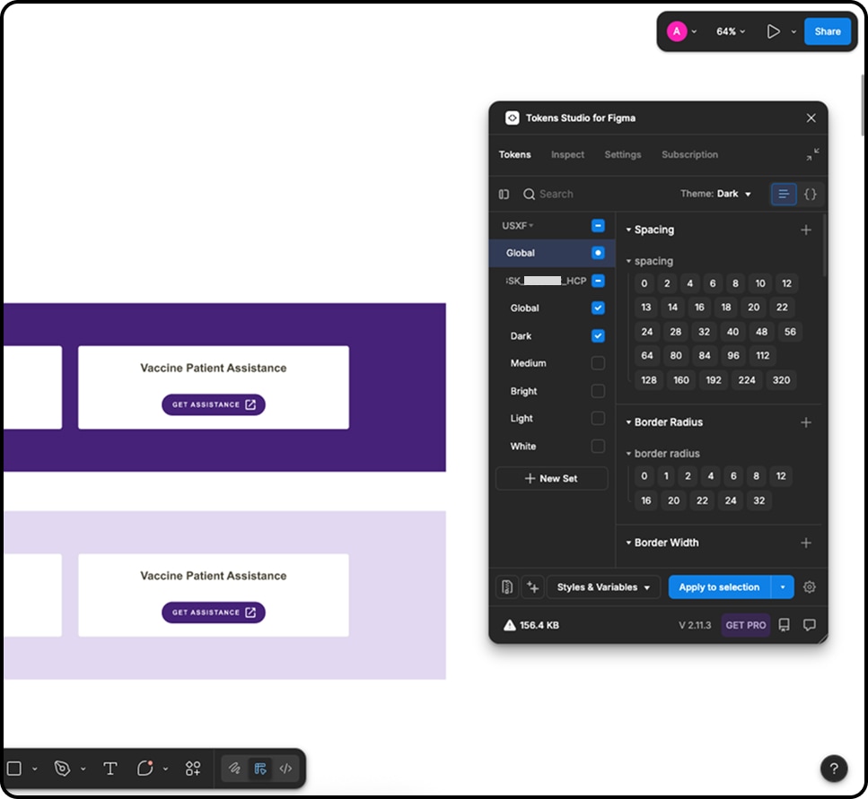
Once the color palette was approved we could add the brand theme to the components we selected.
3. Review & Implementation support
Designs went through a structured, multi-stakeholder review process before advancing to development, a requirement of the regulated pharmaceutical industry. Worked closely with the DXM team, developers, proofreaders, project managers, copy writers and clients through iterative reviews to ensure accurate implementation, consistency across updates, and a smooth transition to launch.
Challenge
Strong communication and timely feedback were required to manage evolving client specifications, which sometimes needed additional DXM and developer reviews, potentially delaying the launch.
Solution
I coordinated the changes closely with the project manager for her to align developers, DXM team, developers and clients, addressing updates efficiently and maintaining consistency across all of them. This ensured a smooth and accurate launch despite evolving requirements.
Iterations
- Client: Requested a new homepage section mid-project, requiring layout restructuring
- DXM Team: Identified mandatory component elements that had been turned off, requiring section-level redesigns to meet design system compliance
- Dev Team: Surfaced asset adjustments and implementation clarifications during staging, tracked and resolved via Jira
Key decision
After a subpage was presented to the client before DXM and dev validation — requiring a rollback due to non-compliant components — I coached the team and restructured the review sequence for all subsequent pages to include DXM and dev before client presentation, preventing rework and managing expectations proactively.
4. UAT & quality Assurance
Performed full UAT and QA review on staging pages to ensure alignment with design, functionality, and consistency across desktop and mobile breakpoints. Issues were tracked and resolved through JIRA prior to launch.
Challenge
The QA review required a high level of attention to detail. We needed to verify that spacing, font sizes, font styles, colors, margins, image ratios, accessibility, and layout structure worked correctly across both desktop and mobile versions. Otherwise, pages could be sent back to us.
Actions
- Audited spacing, typography, and layout consistency across breakpoints
- Verified responsive image rendering and CTA behavior
- Logged and tracked all discrepancies via Jira for the development team to implement fixes
- Gave final design approval on the developed build before moving to launch
Findings
Issues were primarily implementation-level: spacing inconsistencies, a broken link, and images not rendering correctly across breakpoints, all resolved before sign-off.
Designed for both desktop and mobile. It was needed to confirm that the web page worked as planned for both breakpoints.
5. Final team review & pre-Launch Check
A final live review was performed where the entire cross-functional team participated to ensure alignment, confirm all fixes, and approve the site for launch.
Actions
- Compiled the final version of the Rendition PDF, including metadata, matrix links, and screenshots of the approved staging build
- Submitted the final package to the company’s official asset management platform, where all approvals and design records are formally registered
- Confirmed final sign-off before handoff to launch
Results
Accesibility compliance
100% of approved color combinations for web use met WCAG 2.1 AA accessibility standards establishing a validated color foundation for the brand’s standalone digital presence
Working files
The Figma files from the design process are now the official web design files for the brand. They are cleaned, organized, and attached to the main Design System for future updates and use by other designers or agencies.
Full functional web page for the brand
The vaccine brand moved from a buried subpage to a dedicated domain, enabling independent marketing strategies, traffic tracking, and increased visibility among HCPs
Delivered on time
Even though timelines were tight, we completed the pages on schedule. A high level of iteration and strong team communication were critical to achieving this.
Themes integrated to the main DS
The brand now has its own themes integrated the Global Design System, so any future updates will automatically apply to the components used on the brand’s pages.